Grand Revealance of Posters & Boards

I’m very aware of the relationship that is developed between two people from the bottom to the top of a mountain, in just a 15 minute or so chair lift ride. In those fifteen minutes, your gear can act as a sales pitch as much as a conversation starter; which is why I’ve decided that I want to shed a lot of light on the subliminal messages that can be perceived by something as simple as the graphics on the bottom/top on a snowboard or skis.


I wanted to pick out some topics of interest that I want to draw more attention to and also a customized piece by a customer request was included in this project.


Initially, I had intended on doing a 6 poster series with 1 snowboard mockup. Immediately as I dove into designing the posters I felt unattached to just the poster series so I wanted to kind of shift weight and for every poster designed I wanted a complimentary board design along side of it. To show how marketing/advertising poster components can morph into something else that gives a snowboarder a personality representation on the mountain. Representing something that is important to them, or an impersonation of what makes them who they are.


The series:

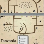
A cause driven by a friend, who has driven a non profit school in Karatu, Tanzania. I designed this map hoping that it could represent the area that the school is in and give it some recognition and maybe draw people to pay more attention to situations like this. http://www.tanzania-schools.org/ is where you can find more on the school and the people who support it.


A customized order came in from Katie Smith of Hanover, Maine. A new business owner at the age of 21 who is a free spirit by every definition. She has an obsession with dream catchers, apparently she has somewhere near 10 or 11 in her room. I stemmed off of that, and went with a design that was representational of her free spirit, love for travel and feathers.


A customized design was also made for Black Bear Energy, a Maine grown energy company that has pure intentions of giving natural energy and replenishment to as many lives as they can reach. www.blackbearb12.com is where you can find out more about their products. I pulled their new can design and color schemes to give out basic information and representational mood for the company for both the poster and design.

Current progress for final project

I have unraveled an old wake board/uni-ski? Which will have to suffice for my final attempt at a representation of a board design…decisions regarding which design I will choose to blow up to that size is still on the fence but so far I’m leaning towards something.


I have currently finished 2 out of my 5 poster designs.

left to do:

get quote for potential NANO GRANT from New Media department

3 posters

board alternative designs

printing/application of one print to board.

Contact has been made!

People who I have spoken/discussed/gotten excited with about the upcoming design series:


Tanzania School/Karatu Tanzania School–authorization is hidden for clients sake

Katie Smith/Massage Therapy

Black Bear Energy–Cassandra Yasko

Clayton Carter/Farmers Market Coordinator

UMaine Ski and Snowboard Club President Cameron Ray


Which means ALL CONTACTS HAVE BEEN MADE!


(victory dance)

A new addition to the design pool…

The plot thickens with a fabulous cause, the Tumaini School in Karatu Tanzania.

http://tanzania-schools.org/

This school is funded by an acquaintance of mine who has devoted a portion of her life (along with her family) towards improving the life and education of those who inhabit the Karatu area.


To shed some light on this little known area I’ve decided to create a map. A basic outline to give an idea of what this area is really like.


This design  will hopefully be able to be used by the founder and will hopefully but accepted in the area later on down the road.

Color Schemes

My color scheme has been chosen for a guideline and ruler for each individual piece. I’m going to use my knowledge of color relationship and how they depict certain representations and meanings so that the most optimal representation of each cause or person can have the best perceptiveness.


currently the assignment of these color schemes is for me and my designing brain only–


but here’s a sneak peak.


Intent for project

For the past 3 months I have been brainstorming ways to go about tackling a project of a design series devoted to 3 or 4 separate (under the radar) organizations, causes, current events that really draw attention mentally from people who care to put concern in that direction. I would take these designed posters and artworks which could be sold individually as prints of all sizes for students in their dorm rooms or on etsy.com to get my work out in the light. I would then take it a step further and adjust the design to be scalable to fit the dimensions of the average snowboard.


The reason behind the board→ I have had the same snowboard for the past 5 years…I’ll admit (even though it breaks my heart) that it may be time to put her on the shelf and get a new one. Maybe its my designing eye—but I refuse to ride a board that doesn’t reflect the kind of person I am style wise, in terms of composition and color it will end up playing a huge role in the decision I make on my next purchase.


The perfect selection of color combinations, the (hard to see) matt swirl design placed on the shiny graphics to create a multi textured feel and look which hidden pictures and words which always keep you searching. Every time I have gotten my board out of the closet for a new season I get the same reaction EVERY time, “Shelby, that IS you in board form, it looks like you designed that yourself.” This has fueled my desire to design snowboards for men and women alike to find the board that perfectly represents their personality and passion on a board that brings a community of people together every season on and off of the mountain. The winter sports community has such a diverse creative group of people in it that I am a proud member of this active universal club.


The Series:


Orono Farmers Market→

http://snakeroot.net/orono/


Clean Water in our area → http://topics.bangordailynews.com/topic/Clean_Water_Act


Ski and snowboard club or if I can go bigger 2014 olympic winter games →

http://sochi2014.com/en/


all natural energy drink Black Bear B12 from MAINE→

http://www.blackbearb12.com/


smoke free campus→

http://www.umaine.edu/tobaccofree/why-should-umaine-become-tobacco-free/ →promote electric or battery powered instead


2012 burton graphic designs


CAPSTONE: Business, creative customization, website where a group of people can direct their requests to me for designs and I can create a snowboard or ski graphic towards them so that there is viral media and a way to get the word out with this community for what they’re doing.


The board series in display setting would have all front designs of boards facing out about 4 feet away from a wall—a mirror (large) is on the wall so that while looking at the boards you can see the bottom of the board as well and at the same time so you can see how they relate to each other.