Jolines Final Release Questions–Answered.

NMD 206 Final Project

class presentation: (5-7 minutes)

TIPS:
-be sure your presentation is clear, concise and brief

going through the grand revealing of my project ( a post that has done previously ) will take up time and putting in more of my own intuitive sight on the whole scenario I’m trying ot create will also take care of a lot of this time period, along side of presenting and explaining each poster.

-focus on the highlights of your work and 3 topics below

The highlights of my work are the underlying inspirations for each peace and how each interpreted poster can be transformed into a board graphic that can be had for years and shown to as many people as possible.

-use your website/blog as you need to show product, process, or learning.

consider it done.

Part 1 What did you make?

-begin on your blog page for your project. this page should clearly state what the project is, with photos or video, and possibly a link to a page where the project actually resides if the project is a web-based project. For an example see: http://lindsayheald.wordpress.com/release/

-show your full project
Lindsey’s was a full website with the front interface for the RidesForMe project; yours might be a T-shirt, or video, or chalk board

My website blog and posters to show for the project.

-be sure you have addressed the following: research, tools, content, format, peers, audience. While you may not show these pages, they will help you with parts 2 & 3  of this presentation.

Part 2: How did you make it?

-describe the original goal, challenges, how you met the challenges, and what you ended up with.

My original idea was posted before as an approach/intent, but I’ll catch you readers up to speed with a short version. Since I’ve been snowboarding I’ve seen what a great conversation starter snowboards and skis can spark on a lift ride with their graphics alone. What an easy window to take advantage of and place meaningful designs for communication between people of all demographics who do the same activity. At first I was going to do 6 posters and 1 board rendition of a poster–but I felt such a disconnect from the snowboard theme that I transferred my idea to 3 posters and each poster’s key components that really represented the message was then transferred to the board silhouette to represent it’s own board design as well. Ending product with 6 posters.


-what tools, software, filters, helpers etc did you use to achieve your goals?

I used Adobe Illustrator to render out my ideas and found inspiration from already existing websites or color schemes to guide me through to my final products.

Part 3: What did you learn?

-what was your original question or inspiration?

The question is and always will be, how can we most accurately and intriguingly represent the cause or person in a aesthetically pleasing design that can be applied to whatever the customer/product needs to be communicated.

-what did your research, creative work or assessment of audience teach you?

Research amongst many snowboard sites such as EVO.com Burton.com K2.com to guide me towards previous designs that have made it to the top along with listening to the customers requests and requirements is what really lead me to find ease in my final renditions of posters/board designs.

-what do you know now that you didn’t before your project? & -how have you grown?

Even if there is a steady plan laid out ready to be executed, emotions and needs need to be listened to intuitively as a designer so that your ending products show the heart and care that was put into the final products.

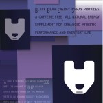
Grand Revealance of Posters & Boards

I’m very aware of the relationship that is developed between two people from the bottom to the top of a mountain, in just a 15 minute or so chair lift ride. In those fifteen minutes, your gear can act as a sales pitch as much as a conversation starter; which is why I’ve decided that I want to shed a lot of light on the subliminal messages that can be perceived by something as simple as the graphics on the bottom/top on a snowboard or skis.


I wanted to pick out some topics of interest that I want to draw more attention to and also a customized piece by a customer request was included in this project.


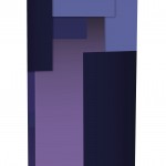
Initially, I had intended on doing a 6 poster series with 1 snowboard mockup. Immediately as I dove into designing the posters I felt unattached to just the poster series so I wanted to kind of shift weight and for every poster designed I wanted a complimentary board design along side of it. To show how marketing/advertising poster components can morph into something else that gives a snowboarder a personality representation on the mountain. Representing something that is important to them, or an impersonation of what makes them who they are.


The series:

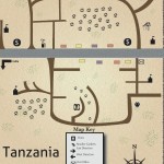
A cause driven by a friend, who has driven a non profit school in Karatu, Tanzania. I designed this map hoping that it could represent the area that the school is in and give it some recognition and maybe draw people to pay more attention to situations like this. http://www.tanzania-schools.org/ is where you can find more on the school and the people who support it.


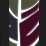
A customized order came in from Katie Smith of Hanover, Maine. A new business owner at the age of 21 who is a free spirit by every definition. She has an obsession with dream catchers, apparently she has somewhere near 10 or 11 in her room. I stemmed off of that, and went with a design that was representational of her free spirit, love for travel and feathers.


A customized design was also made for Black Bear Energy, a Maine grown energy company that has pure intentions of giving natural energy and replenishment to as many lives as they can reach. www.blackbearb12.com is where you can find out more about their products. I pulled their new can design and color schemes to give out basic information and representational mood for the company for both the poster and design.

Current progress for final project

I have unraveled an old wake board/uni-ski? Which will have to suffice for my final attempt at a representation of a board design…decisions regarding which design I will choose to blow up to that size is still on the fence but so far I’m leaning towards something.


I have currently finished 2 out of my 5 poster designs.

left to do:

get quote for potential NANO GRANT from New Media department

3 posters

board alternative designs

printing/application of one print to board.

Contact has been made!

People who I have spoken/discussed/gotten excited with about the upcoming design series:


Tanzania School/Karatu Tanzania School–authorization is hidden for clients sake

Katie Smith/Massage Therapy

Black Bear Energy–Cassandra Yasko

Clayton Carter/Farmers Market Coordinator

UMaine Ski and Snowboard Club President Cameron Ray


Which means ALL CONTACTS HAVE BEEN MADE!


(victory dance)

A new addition to the design pool…

The plot thickens with a fabulous cause, the Tumaini School in Karatu Tanzania.

http://tanzania-schools.org/

This school is funded by an acquaintance of mine who has devoted a portion of her life (along with her family) towards improving the life and education of those who inhabit the Karatu area.


To shed some light on this little known area I’ve decided to create a map. A basic outline to give an idea of what this area is really like.


This design  will hopefully be able to be used by the founder and will hopefully but accepted in the area later on down the road.

Color Schemes

My color scheme has been chosen for a guideline and ruler for each individual piece. I’m going to use my knowledge of color relationship and how they depict certain representations and meanings so that the most optimal representation of each cause or person can have the best perceptiveness.


currently the assignment of these color schemes is for me and my designing brain only–


but here’s a sneak peak.